Python's Folium to create choropleth maps

Folium is python library built on top of leaflet.js. It is used to visualize data through interactive maps, choropleth visualization, as well as parsing markers on data.
If you are interested in the agricultural aspect and results of this analysis, checkout this post- visualizing agricultural commodities in karnataka
For ipython notebook code, checkout my github
What will be covered in this blog?
- data preparation - merging,sorting,grouping using pandas. (step 1-5)
- barplot visualization using seaborn (step 6)
- creating maps using python's folium - tiles, circle marker, choropleth map, and geojson. (step7-9)
- creating labels on choropleth map using geojsontooltip. (step 10)
- Displaying multiple data views on the same map using feature group and control layer.(step 11)
- Calculate market share(step 12)
- Calculate largest commodity in each district(step 13)
- Create markers and use custom icons. (step 14)
Pitfalls to avoid
I broke my head for several hours so that you dont have to.
- Avoid using jupyter lab in chrome, use firefox instead. Chrome did not render large maps.This will be useful in step 11.
- While creating choropleth map we will be using geojson data.Make sure the values in the key column (district name, or state) is same across this file and the original data.
- folium.Choropleth() doesn't provide an option for creating labels on top, use geojsontooltip along with it to create labels.
If you are not interested in the data preparation method, skip to step 7 to start off with folium maps.
Step 1 : import necessary libraries
import pandas as pd
import matplotlib.pyplot as plt
import seaborn as sns
import folium
step 2 : pick a data
Pick a data you are interested in. I've considered agriculture market data from karnataka(2012).
data = pd.read_excel('./data/CommMktArrivals2012.xls')
data.columns
"""output: Index(['District Name', 'Taluk Name', 'Market Name', 'Address', 'Telephone',
       'Commodity', 'Year', 'Month', 'Arrival', 'Unit'],
      dtype='object')
      """
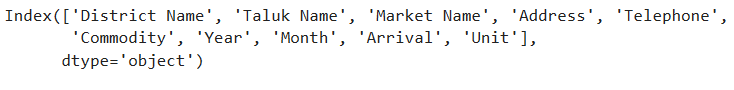 Fig.1: The fields in the data
Step 3 : Data preperation
There are 156 Commodities in the data. We will only consider commodities whose units are in quintal, so other commodities such as coconut,Ox will be left out. This is done for the sake of uniformity.
Also we do not require all the columns. Hence filter the columns needed.
‘sum’ function is used to obtain the sum of all items (our focus is on the ‘Arrival’) based on the groupings.
df = data.groupby(['Commodity','District Name','Unit'],as_index=False)
df = df.sum().filter(["Commodity","District Name","Arrival","Unit"])
df_quintal = df[df["Unit"]=="Quintal   "]
df_quintal.head()
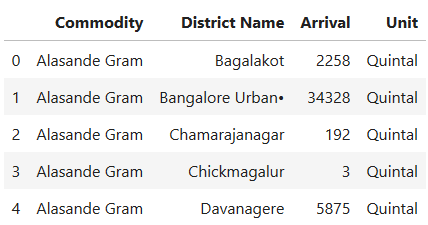 Fig.2: filtered data
Note that ‘Arrival’ here refers to the arrival of commodities at a place for sale, from various source such as villages, storages,etc.
Commodities which will be left out of the analysis are:
df_notquintal = df[df["Unit"]!="Quintal   "]
df_notquintal.Commodity.unique()
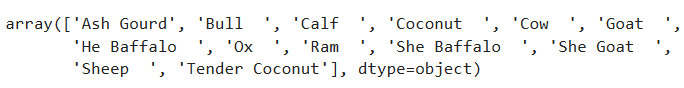 Fig.3: excluded commodities
Step 4 : Latitude and longitude
Not all datasets come with geogrophical values. So create an excel file and populate districts with their latitude and longitude values.
kar_latlong = pd.read_excel("./data/karnataka_latlong.xlsx")
Now, merge this file with the original data df
df_merged = pd.merge(df,kar_latlong)
df_merged.head()
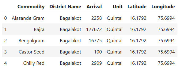 Fig.4: data merged with latitude and longitude
Note that we will be using this data “df_merged” throughout this example.
Step 5: Obtain Geojson data
Geojson is a popular format for representing geographical features.Its a Json file which contains polygon structures of states,districts,etc.
Make sure the key column in geojson data, such as “District Name” or " id” , matches with the original data.If not, modify it to match.
state_geo = f'./data/kar.json'
Step 6: Bar graph to visualise top 10 commodities
This is to plot the top ten commodities, with the criteria of highest arrivals. We group the elements by commodity, unit and sort them in descending order of arrival quantity.
dfg  = df_merged.groupby(['Commodity','Unit'],as_index=False)

topten_df = dfg.sum().sort_values(by='Arrival',ascending=False).head(10)
topten_df
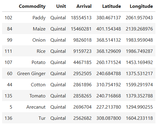 Fig.5: Top ten commodities in karnataka measured(arrival values)
Then we use seaborn library's barplot to plot. As we can see the top Commodities from karnataka are paddy,maize,onion,rice,potato,cotton,green ginger,tomato,arecanut and tur.
fig = sns.barplot(topten_df['Arrival'],topten_df['Commodity'])
plt.title("Top 10 Commodity in karnataka - Agriculture market data (2012)")
plt.xlabel("Arrival.(In quintal). source: data.gov.in\nNote: Only Commodities with unit in quintal is considered here,\n hence Coconut has been left out.")
plt.savefig("topten_df",bbox_inches="tight")
plt.show(fig)
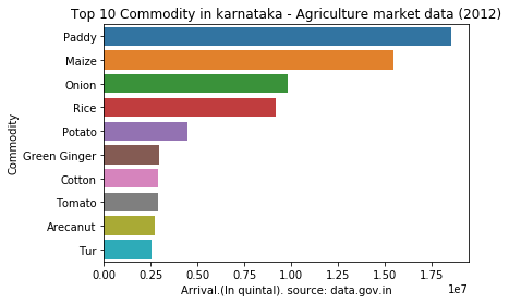 Fig.6: bar plot of top ten commodities
step 7: Creating basic folium map
Foilum can be used to visualize geographical data.
m = folium.Map(location=[15,75],
               zoom_start=6.5,tiles='Stamen Toner'
m.save('map.html')
m
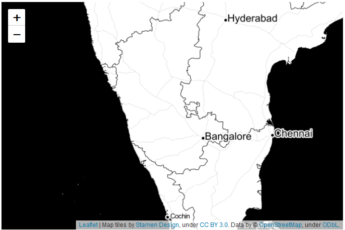 Fig.7: Basic map using folium
Map() can be used to create a map. Here are few important parameters it takes:
- location : provide latitude and longitude values.
- zoom_start : indicates the starting zoom point.
- tiles : for the map style. The default tiles are set to ‘OpenStreetMap’, but ‘Stamen Terrain’,‘Stamen Toner’,‘Stamen Watercolor’,‘cartodbpositron’, ‘cartodbdark_matter’, and many others tiles are built in.
- add_to() : add_to method is used to add the function to the map or other functions.
- folium.Figure() : Is generally used if you want to set height and width of the figure, but this is not absolutely necessary to create a map, just add_to(m) instead.
step 8: Adding folium circle marker
Circle marker can be added using folium.circle() function. We will filter out paddy Arrival data and link it to the circle.
paddy = df_merged[df_merged["Commodity"]=="Paddy"]
data = paddy

for i in range(0,len(data)):
   folium.Circle(
     location=[data.iloc[i]['Latitude'], data.iloc[i]['Longitude']],
      geo_data="Karnataka",
       popup=str(data.iloc[i]['District Name'])+":"+str(data.iloc[i]['Arrival']),
      radius=float(data.iloc[i]['Arrival']/75),
      color='crimson',
      fill=True,
      fill_color='blue'
   ).add_to(m)
m.save('paddy.html')
m
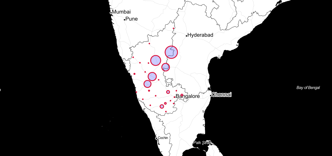 Fig.8: paddy in karnataka, created using folium circle(click on the map for interaction)
parameters in folium circle:
- popup : text to be poped up when the circle is clicked on.
- radius : radius of the circle. here we have linked it to the Arrival value of the paddy data. The bigger the circle, the more paddy arrives in that area.
As we can see circle marker may not be the best representation for this scenario. As the circle radius is value of arrival and doesn't indicate the appropriate boundaries for the districts.
Hence we will make use of choropleth.
Step 9: Create a Choropleth map
- Choropleth is a type of thematic map in which areas (such as districts or state) are coloured with different shapes of a colour corresponsing todesnsity/quantity of the data it is linked to.
- create using folium.Choropleth()
m = folium.Map([15, 74], zoom_start=6,tiles='cartodbpositron')

arecanut = df_merged[df_merged["Commodity"]=="Arecanut"]
state_data = arecanut

choropleth = folium.Choropleth(
    geo_data=state_geo,
    name='choropleth',
    data=state_data,
    columns=['District Name', 'Arrival'],
    key_on='feature.properties.NAME_2',
    fill_color='YlGn',
    fill_opacity=0.7,
    line_opacity=0.2,
    legend_name='Arecanut Arrival(in Quintal)',
    highlight=True,
    line_color='black'
).add_to(m)

folium.LayerControl(collapsed=True).add_to(m)
m
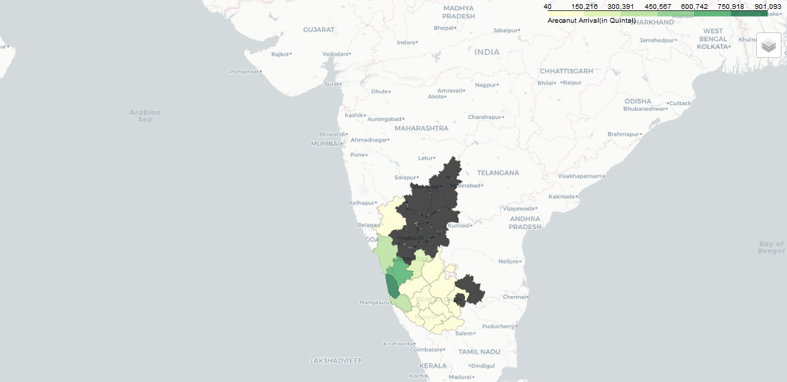 Fig.9: Arecanut in karnataka, A choropleth map(click on the map for interaction)
Step 10: Add label to choropleth using GeoJsonTooltip
- This is the most basic version of a GeoJsonTool tip
- add_child() function is used to add this under choropleth
- ‘NAME_2’ is a field from state_geo containing district names.
choropleth.geojson.add_child(
    folium.features.GeoJsonTooltip(['NAME_2'],labels=False)
)
m
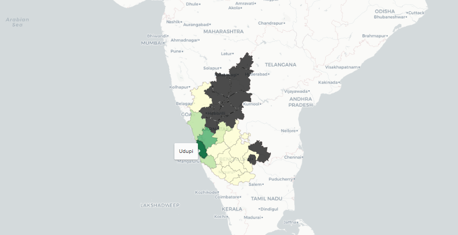 Fig.10: Adding labels to a choropleth map using GeoJsonToolTip (click on the map for interaction)
Step 11: displaying multiple data using feature group and layer control
- As we can see above we were able to visualize map for arecanut across karnataka. But what if we want to view paddy or maize? Should we create seperate maps for each? Is there a way to view multiple commodities in a single map?
- The answer to this is using FeatureGroup.
- Multiple features can be passed to a single feature group to group them together
- And then multiple feature groups can be created and added to layer control
- this gives us an option to toggle different views.
from branca.colormap import linear

m = folium.Map([15, 74], zoom_start=6,tiles=None,overlay=False)

#top 10
paddy = df_merged[df_merged["Commodity"]=="Paddy"]
maize = df_merged[df_merged["Commodity"]=="Maize"]
onion = df_merged[df_merged["Commodity"]=="Onion"]
rice = df_merged[df_merged["Commodity"]=="Rice"]
potato = df_merged[df_merged["Commodity"]=="Potato"]

cotton = df_merged[df_merged["Commodity"]=="Cotton"]
greenginger = df_merged[df_merged["Commodity"]=="Green Ginger"]
tomato = df_merged[df_merged["Commodity"]=="Tomato"]
arecanut = df_merged[df_merged["Commodity"]=="Arecanut"]
tur = df_merged[df_merged["Commodity"]=="Banana"]


# feature groups
feature_group0 = folium.FeatureGroup(name='paddy',overlay=False).add_to(m)
feature_group1= folium.FeatureGroup(name='maize',overlay=False).add_to(m)
feature_group2 = folium.FeatureGroup(name='onion',overlay=False).add_to(m)
feature_group3= folium.FeatureGroup(name='rice',overlay=False).add_to(m)
feature_group4 = folium.FeatureGroup(name='potato',overlay=False).add_to(m)
feature_group5 = folium.FeatureGroup(name='cotton',overlay=False).add_to(m)
feature_group6 = folium.FeatureGroup(name='Green Ginger',overlay=False).add_to(m)
feature_group7 = folium.FeatureGroup(name='Tomato',overlay=False).add_to(m)
feature_group8 = folium.FeatureGroup(name='Arecanut',overlay=False).add_to(m)
feature_group9 = folium.FeatureGroup(name='Tur',overlay=False).add_to(m)


fs = [feature_group0,feature_group1,feature_group2,feature_group3,feature_group4,feature_group5,
      feature_group6,feature_group7,feature_group8,feature_group9]
commodities = [paddy,maize,onion,rice,potato,cotton,greenginger,tomato,arecanut,tur]
for i in range(len(commodities)):
    choropleth1 = folium.Choropleth(
    geo_data=state_geo,
    name='choropleth',
    data=commodities[i],
    columns=['District Name', 'Arrival'],
    key_on='feature.properties.NAME_2',
    fill_color='YlGn',
    nan_fill_color="black",
    fill_opacity=0.7,
    line_opacity=0.2,
    legend_name='Arrival (in Quintal)',
    highlight=True,
    line_color='black').geojson.add_to(fs[i])


    #geojson for labels
    geojson1 = folium.GeoJson(data=state_geo,
               name='karnataka district',
                         smooth_factor=2,
               style_function=lambda x: {'color':'black','fillColor':'transparent','weight':0.5},
                tooltip=folium.GeoJsonTooltip(fields=['NAME_2'],
                                              labels=False,
                                              sticky=True),
              highlight_function=lambda x: {'weight':3,'fillColor':'grey'},

                       ).add_to(choropleth1)


colormap = linear.YlGn_09.scale(
df_merged.Arrival.min(),
df_merged.Arrival.max()).to_step(10)
colormap.caption = 'Arrival (in quintal)'
colormap.add_to(m)


folium.TileLayer('cartodbdark_matter',overlay=True,name="dark mode").add_to(m)
folium.TileLayer('cartodbpositron',overlay=True,name="light mode").add_to(m)

folium.LayerControl(collapsed=False).add_to(m)
m.save('topten_commodities.html')
m
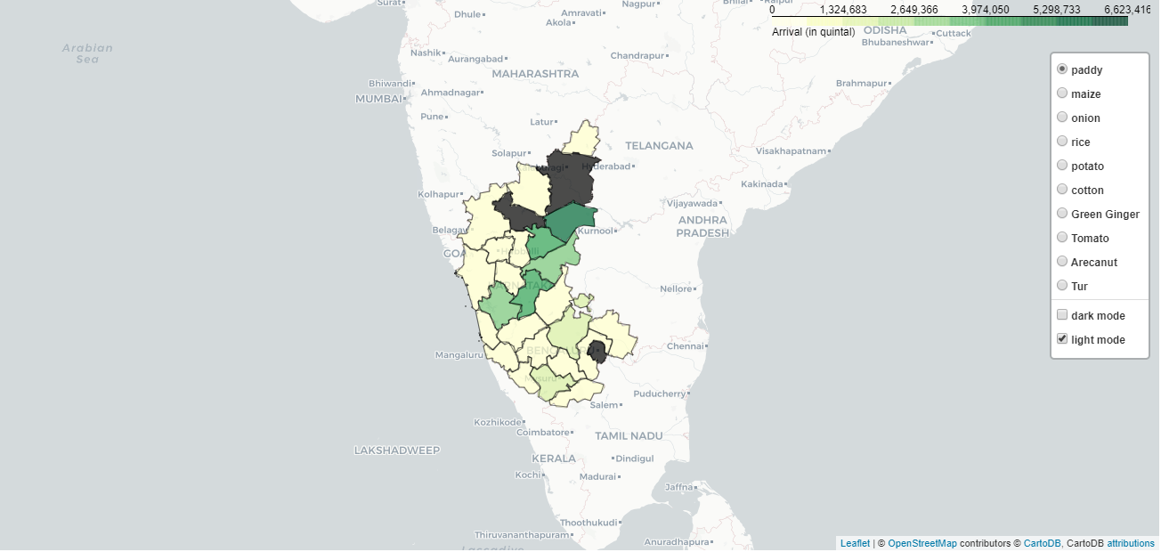 Fig.11:Multiple data view lapyer in a single map - top ten Commodities (click on the map for interaction, this map may take time to load because of large file size)
Step 12: Calculate market share - Percentage of Commodity in a district
This step is not necesary for visualisation, but the data can be used for insights
# percent of Paddy from Raichur
paddy = df_merged[df_merged["Commodity"]=="Paddy"]
paddy[paddy["District Name"]=="Raichur"].Arrival/paddy.Arrival.sum() *100
# o/p -> 20.285221

## percent of Tomato from Kolar
tomato = df_merged[df_merged["Commodity"]=="Tomato"]
tomato[tomato["District Name"]=="Kolar"].Arrival/tomato.Arrival.sum() *100
o/p -> 51.956799
step 13 : Calculate largest commodity in each district
- Large number of commodities arrive at each district, we need to find the one with largest arrival value
- We can use the resulting max_commodity data to place relevant commodity icon for each district in the next step.
max_commodity={}
#create list of unique districts
districts = df_merged["District Name"].unique()
for el in districts:
    #filter out data of each district
    df_dis = df_merged[df_merged["District Name"]==el]
    #obtain the commodity with maximum arrival in each district
    max_each_district  = df_dis[df_dis.Arrival == df_dis.Arrival.max()].Commodity.iloc[0]
    #fill it in max_commodity as district:max_commodity_for_each_district
    max_commodity[df_dis["District Name"].iloc[0]] = max_each_district
max_commodity
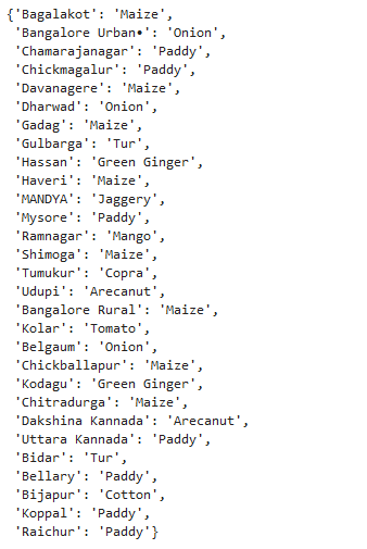 Fig.12: Largest commodities in each district
Step 14: Create markers and use custom icons
Custom icon can be created using a image file, and used as a marker.
Each icon is dynamically taken depending upon the largest commodity name for each district.
m = folium.Map(location=[df_merged['Latitude'].mean()+1,df_merged['Longitude'].mean()],
               zoom_start=6.5)

data_cm = kar_latlong

geojson = folium.GeoJson(data=state_geo,
                         smooth_factor=2,
               style_function=lambda x: {'color':'black','fillColor':'green','weight':1},
                tooltip=folium.GeoJsonTooltip(fields=['NAME_2'],
                                              labels=False,
                                              sticky=True),
              highlight_function=lambda x: {'weight':3,'fillColor':'grey'},
                       ).add_to(m)
# marker and icon
for i in range(0,len(data_cm)):
    #changing file name depending upon largest commodity for the district
    icon_image = "./img/icons/"+str(max_commodity[data_cm.iloc[i]['District Name']])+".png"
    icon = CustomIcon(
    icon_image,
    icon_size=(30, 30),
    icon_anchor=(15, 15),
    popup_anchor=(-3, -76)
)
    folium.Marker(
    location=[data_cm.iloc[i]['Latitude'], data_cm.iloc[i]['Longitude']],
    icon=icon,
    radius=float(15000.0),
    popup=str(data_cm.iloc[i]['District Name'])+":"+str(max_commodity[data_cm.iloc[i]['District Name']])
    ).add_to(m)

folium.LayerControl(collapsed=True).add_to(m)

m.save('icon_commodity.html')
m
![]() Fig 13: Largest commodities in each district. Click on the image for the interactive map. Icons made by Freepik from www.flaticon.com
Fig 13: Largest commodities in each district. Click on the image for the interactive map. Icons made by Freepik from www.flaticon.com
In this post we learnt how to use folium for interactive maps, prepare the data using pandas, use geojson data, create choropelth map and add labels, use multiple data layers, and add custom markers. For more information on folium check out their official documentation.
Nagaraj Bhat
Master of data analytics
I build awesome ML products. Interests - Python, Machine learning, and poetry.